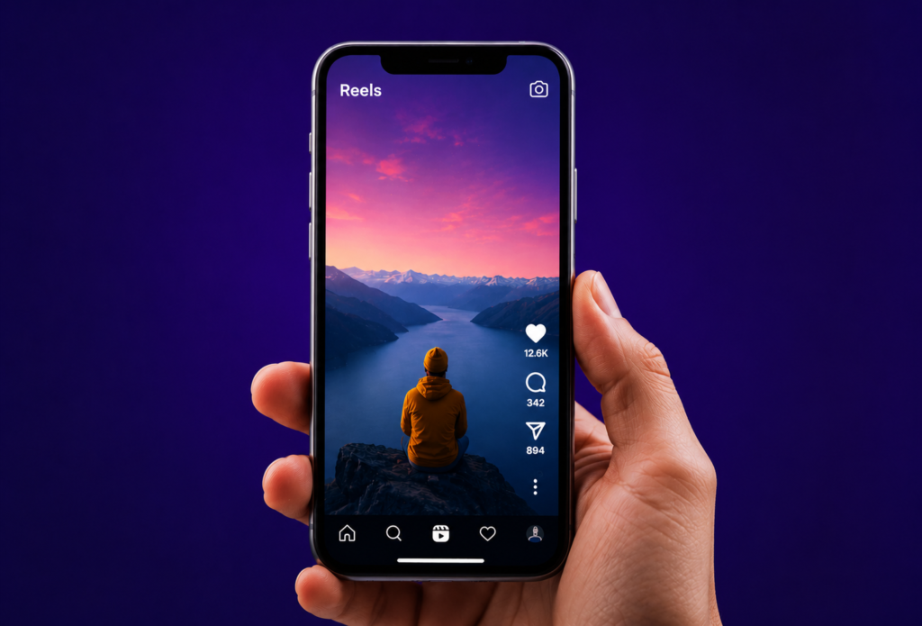
Readable, on-brand caption treatments viewers actually follow.
Why Captions Matter in Short-Form Video
Captions are no longer just a way to make videos accessible without sound.
Good captions can guide attention, emphasize important ideas, improve comprehension, and make a video feel more polished.
When viewers are scrolling quickly, well-designed captions help them understand the message before they decide whether to keep watching.
The key is to make captions easy to read without distracting from the content.
1. Clean Minimal Captions
The simplest style is often one of the most effective.
Use:
- A clean sans-serif font
- Short lines
- Consistent spacing
- Simple positioning
- High contrast
Keep the caption close to the speaker without covering their face.
This style works particularly well for educational, professional, and personal-brand content.
Example:
Your first three seconds determine whether people stay.
The viewer immediately knows what the speaker is saying without being overwhelmed by visual effects.
2. Keyword Highlight Captions
Instead of styling every word equally, emphasize the most important words.
For example:
Your first THREE seconds determine whether people STAY.
The highlighted words act as visual anchors.
This helps viewers quickly identify the main message while scrolling.
Use this style for:
- Tips
- Tutorials
- Educational videos
- Marketing content
- Business advice
3. Word-by-Word Captions
Word-by-word captions reveal the text progressively as the speaker talks.
This creates movement on screen and gives viewers something to follow.
For example:
Create
content
people
actually
want
to watch.
This style can work especially well for fast-paced videos, motivational content, and short statements.
However, avoid making the animation so fast that viewers struggle to read it.
4. Dynamic Emphasis Captions
Dynamic captions change size, position, or emphasis when an important word is spoken.
For example:
Stop
scrolling.
Your content isn't the problem.
Your HOOK is.
The visual change makes important moments feel more impactful.
Use dynamic emphasis selectively.
If every word is animated, nothing feels important.
5. Highlight Bar Captions
A subtle background or highlight bar can make captions easier to read over busy footage.
For example:
BUILD YOUR PERSONAL BRAND
The highlight separates the text from the background while also creating a recognizable visual style.
This works particularly well when your videos contain:
- Outdoor footage
- Fast-moving backgrounds
- Bright visuals
- Product demonstrations
- Multiple camera angles
Keep the highlight treatment consistent with your brand.
6. Large Statement Captions
Sometimes the caption itself can become the main visual element.
Use large text for short, powerful statements.
For example:
STOP POSTING
WITHOUT A
STRATEGY.
This style works well for hooks and major transitions.
Because the text is large, keep the message short.
One strong sentence is usually better than a large paragraph.
7. Branded Caption Systems
A branded caption system combines typography, spacing, colors, positioning, and animation into a consistent visual language.
For example, your brand might always use:
- One specific font
- One highlight color
- Rounded text backgrounds
- Consistent caption placement
- The same animation style
- A recognizable keyword treatment
After viewers see enough of your content, they may begin recognizing your videos before they even see your username.
That's the real power of branded captions.
How to Choose the Right Caption Style
Different content needs different treatments.
| Content Type | Recommended Style |
|---|---|
| Educational | Minimal + Keyword Highlight |
| Podcast Clips | Minimal + Dynamic Emphasis |
| Motivational | Large Statement |
| Tutorials | Keyword Highlight |
| Business Content | Branded Captions |
| Fast-Paced Content | Word-by-Word |
| Outdoor / Busy Footage | Highlight Bar |
The important thing is consistency.
You don't need seven different caption styles in every video.
Choose one primary style and a few variations that fit your brand.
Caption Design Rules to Follow
Keep Text Short
Avoid putting an entire paragraph on screen.
Break long sentences into smaller pieces.
Make It Readable
Choose a font size that works on mobile screens.
Maintain Contrast
Text should remain clearly visible against the footage.
Don't Cover Important Visuals
Avoid placing captions over faces, products, or important graphics.
Match the Brand
Your caption style should feel like part of your overall visual identity.
Use Animation Carefully
Animation should guide attention, not distract from the message.
A Simple Caption Formula
For your next Reel or Short, try:
HOOK
Use large, attention-grabbing text.
↓
EXPLANATION
Use clean readable captions.
↓
KEY POINT
Highlight the important words.
↓
PAYOFF
Use a stronger visual treatment for the final takeaway.
This gives your captions a natural visual hierarchy.